Color Wheel Opposite of Brown | Where Is Brown on the Color Wheel
Have you ever wondered what the opposite of brown on the color wheel is? If you’re a designer or artist, you know that understanding color theory is essential to creating visually pleasing designs. A color wheel is a tool that helps us understand the relationships between colors and how they interact with each other.
What is the color wheel?
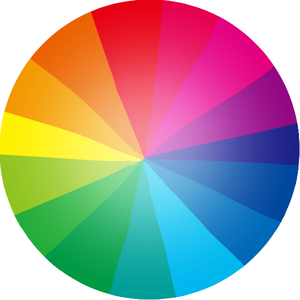
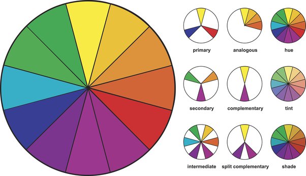
The color wheel is a circle that consists of primary, secondary, and tertiary colors. Primary colors are red, blue, and yellow, and they cannot be created by combining other colors. Secondary colors are green, orange, and purple, and they are created by mixing two primary colors. Tertiary colors are a combination of a primary and a secondary color.
The opposite of brown on the color wheel
Brown is not a primary or secondary color, so it does not have a direct opposite on the color wheel. However, brown is a warm color, and the opposite of warm colors on the color wheel are cool colors. The cool colors that complement brown are blue and green.

Which Colour Are Exactly Opposite To Brown?
The opposite (complementary) color of brown on the traditional color wheel is a bluish-purple color. Here are some examples of blues and purples that complement brown:
• Royal blue – This rich, dark blue contrasts well with brown tones, creating visual interest when paired together.
• Eggplant purple – This deep, dusky purple shade provides a strong contrast to brown but also carries some of the warm, earthy tones that brown evokes.
• Lavender – A softer, lighter purple, lavender provides enough contrast to help brown “pop” while also being a harmonious pairing.
• Teal blue – A blue-green color on the cool side of the color wheel, teal creates a subtle yet distinct complement to brown shades.
Understanding complementary colors
Complementary colors are two colors that are opposite each other on the color wheel. When placed next to each other, they create high contrast and can make each other appear brighter. Brown is a warm color, and its complementary colors are blue and green, which are cool colors.
How to use complementary colors in design?
Complementary colors can be used in design to create a visually appealing contrast. For example, using brown and blue in a design can create a calming and sophisticated atmosphere. Brown can also be paired with green to create a natural and earthy feel. When using complementary colors, it’s important to balance them out and not overuse them, as they can become overwhelming.
Color Relations In Wheel
The color wheel is a useful visual model that illustrates the relationships between different colors. Here are some key color relation concepts in the color wheel:
• Complementary colors: Colors that are opposite each other on the color wheel, such as red and green or blue and orange. These colors contrast and enhance each other when used together.
• Analogous colors: Colors that are next to each other on the wheel, such as green, blue-green, and blue. Analogous colors create harmony and consistency when used together.
• Triadic colors: Any three colors that are evenly spaced around the wheel, forming an equilateral triangle. Triadic color schemes provide variety and visual interest.
• Tetradic colors: Any four colors formed by opposite colors on the wheel, creating two complementary pairs. Tetradic color schemes tend to be more dynamic and visually stimulating.
• Primary colors: Red, yellow and blue. These are the fundamental hues that can be mixed to produce all the other colors in the spectrum.
• Secondary colors: Orange, green and purple. Formed by mixing two primary colors.
The color wheel can help you identify harmonious and contrasting color combinations for your visual designs, logos, graphics, and more. Understanding color relationships will enable you to create balanced, aesthetically pleasing color schemes.
The importance of color harmony
Color harmony is the relationship between colors in a design. Creating harmony in a design can help create a sense of unity and balance. When using complementary colors, it’s important to also consider other colors in the design and ensure they complement each other.
The Psychology of Brown
Brown is often associated with earthiness, stability, and comfort. It can create a warm and inviting atmosphere. In design, brown can be used to create a sense of reliability and trustworthiness.
FAQs
What are warm and cool colors?
Warm colors are colors that are associated with warmth, such as red, orange, and yellow. Cool colors are colors that are associated with coolness, such as blue, green, and purple.
Can brown be used as a neutral color in the design?
Yes, brown can be used as a neutral color in the design. It can be paired with other colors to create a warm and inviting atmosphere.
Can brown be used in branding?
Yes, brown can be used in branding. It can create a sense of stability and reliability, which can be important for certain brands.
What are some other colors that complement brown?
Other colors that complement brown are yellow, orange, and red. These colors are also warm and can create a sense of energy and excitement when paired with brown.
Can brown be used in fashion?
Yes, brown can be used in fashion. It can create a natural and earthy feel and can be paired with other colors to create a stylish and sophisticated look.
Color Wheel Opposite of Brown | Where Is Brown on the Color Wheel
Have you ever wondered what the opposite of brown on the color wheel is? If you’re a designer or artist, you know that understanding color theory is essential to creating visually pleasing designs. A color wheel is a tool that helps us understand the relationships between colors and how they interact with each other.
What is the color wheel?
The color wheel is a circle that consists of primary, secondary, and tertiary colors. Primary colors are red, blue, and yellow, and they cannot be created by combining other colors. Secondary colors are green, orange, and purple, and they are created by mixing two primary colors. Tertiary colors are a combination of a primary and a secondary color.
The opposite of brown on the color wheel
Brown is not a primary or secondary color, so it does not have a direct opposite on the color wheel. However, brown is a warm color, and the opposite of warm colors on the color wheel are cool colors. The cool colors that complement brown are blue and green.

Which Colour Are Exactly Opposite To Brown?
The opposite (complementary) color of brown on the traditional color wheel is a bluish-purple color. Here are some examples of blues and purples that complement brown:
• Royal blue – This rich, dark blue contrasts well with brown tones, creating visual interest when paired together.
• Eggplant purple – This deep, dusky purple shade provides a strong contrast to brown but also carries some of the warm, earthy tones that brown evokes.
• Lavender – A softer, lighter purple, lavender provides enough contrast to help brown “pop” while also being a harmonious pairing.
• Teal blue – A blue-green color on the cool side of the color wheel, teal creates a subtle yet distinct complement to brown shades.
Understanding complementary colors
Complementary colors are two colors that are opposite each other on the color wheel. When placed next to each other, they create high contrast and can make each other appear brighter. Brown is a warm color, and its complementary colors are blue and green, which are cool colors.
How to use complementary colors in design?
Complementary colors can be used in design to create a visually appealing contrast. For example, using brown and blue in a design can create a calming and sophisticated atmosphere. Brown can also be paired with green to create a natural and earthy feel. When using complementary colors, it’s important to balance them out and not overuse them, as they can become overwhelming.
Color Relations In Wheel
The color wheel is a useful visual model that illustrates the relationships between different colors. Here are some key color relation concepts in the color wheel:
• Complementary colors: Colors that are opposite each other on the color wheel, such as red and green or blue and orange. These colors contrast and enhance each other when used together.
• Analogous colors: Colors that are next to each other on the wheel, such as green, blue-green, and blue. Analogous colors create harmony and consistency when used together.
• Triadic colors: Any three colors that are evenly spaced around the wheel, forming an equilateral triangle. Triadic color schemes provide variety and visual interest.
• Tetradic colors: Any four colors formed by opposite colors on the wheel, creating two complementary pairs. Tetradic color schemes tend to be more dynamic and visually stimulating.
• Primary colors: Red, yellow and blue. These are the fundamental hues that can be mixed to produce all the other colors in the spectrum.
• Secondary colors: Orange, green and purple. Formed by mixing two primary colors.
The color wheel can help you identify harmonious and contrasting color combinations for your visual designs, logos, graphics, and more. Understanding color relationships will enable you to create balanced, aesthetically pleasing color schemes.
The importance of color harmony
Color harmony is the relationship between colors in a design. Creating harmony in a design can help create a sense of unity and balance. When using complementary colors, it’s important to also consider other colors in the design and ensure they complement each other.
The Psychology of Brown
Brown is often associated with earthiness, stability, and comfort. It can create a warm and inviting atmosphere. In design, brown can be used to create a sense of reliability and trustworthiness.
FAQs
What are warm and cool colors?
Warm colors are colors that are associated with warmth, such as red, orange, and yellow. Cool colors are colors that are associated with coolness, such as blue, green, and purple.
Can brown be used as a neutral color in the design?
Yes, brown can be used as a neutral color in the design. It can be paired with other colors to create a warm and inviting atmosphere.
Can brown be used in branding?
Yes, brown can be used in branding. It can create a sense of stability and reliability, which can be important for certain brands.
What are some other colors that complement brown?
Other colors that complement brown are yellow, orange, and red. These colors are also warm and can create a sense of energy and excitement when paired with brown.
Can brown be used in fashion?
Yes, brown can be used in fashion. It can create a natural and earthy feel and can be paired with other colors to create a stylish and sophisticated look.


